Wellness App
I worked in a team of four UI/UX designers to evolve and expand on BENTEN Technologies' design and bring it closer to development.
Designing for: Full-time spouse or other family caregivers of people living with dementia (mostly 65+).
✶ Improved task completion rate by 200% through user testing and iterative design, resulting in a target-user-friendly experience.
Project Phases


Secondary research, review past work, propose new solution
Sketch app screens, How Might We...? statements, accessibility
Create project dashboard, secondary user research, sitemap, MVP
Design app wireframes, "why" button, collaboration and discussion
High fidelity design, colors, moodboard, final screens for onboarding
Devise test plan, user interviews, analysis and synthesis
ReFrame
The company’s main stakeholders originally wanted us to combine designs created by past interns, conduct user research, and finalize and prototype a fully-functional high-fidelity design.
Meeting for the first time with the CEO, CFO, and product manager.
However, Kyle, Shivam, Esther, and I (the UX team) felt there wasn’t enough previous context available for our team to logically justify combining pieces of different designs and present an iterated version to developers.
I felt the user personas needed more information: none of us had worked with this audience before.
My teammates noticed that the design wasn't very accessible, with inconsistent text sizes, styles, and shapes.
I wondered if questions like "Year of Birth (optional)" were necessary or important to ask in the context of the app's purpose.
Because we needed to revamp the design's foundation, six weeks was not going to be enough time to meet BENTEN's initial expectations. After some discussion with the product team, we proposed a solution that was more feasible for our six-week timeline, including:
- Low-fidelity wireframes that represented the MVP (most viable product)
- Design system based on brand attributes, values, and target audience considerations
- High-fidelity mockups to incorporate the design system and envision a final product
While the rest of the team wanted to scrap user interviews and usability testing entirely, I didn't feel comfortable moving forward without hearing the audience's perspective. In order to be a well-informed advocate of the target users, I decided to take on the user interviews and usability testing on my own, with support from the product manager.
Decide
To get started, I created a project dashboard in Miro where we laid out our various ideas, questions, and inspirations before planning any sort of design.
In order to feel confident speaking on behalf of the audience, I conducted some secondary research on how seniors interact with technology.
The research uncovered that, overall, seniors are willing to trust useful and necessary technology, if it shows them the respect they feel they deserve, and accommodates their physical abilities.
We made sure to take factors such as color vision, font size, and reachability into context when brainstorming UI elements for this audience.


Figures about seniors technology use (above), and compiled secondary research summaries (orange sticky notes below).
After finding plenty of ideas, inspiration, and audience research, we moved onto creating a sitemap with the MVP features.

We touched base with the product team and adjusted based on their comments.
We as a team finalized five features for the MVP: app onboarding, learn module, home screen, community module, and the health log module. I chose to design the onboarding experience.
Sketch
With an MVP in mind, we began to sketch out the app screens.
Resolved questions and and some hand drawn sketches from the UX team (mine in left photo)
In order to keep the sketching process grounded and relevant, I wrote out “How Might We…” and “As a user, I want to…” statements corresponding to the user onboarding.
From previous projects, I learned how much of a dealbreaker a poor onboarding experience is for a first time user.
Some elements blurred as per BENTEN's request.
I wanted to keep all the form content on the top half of the screen: when the keyboard opens, the user doesn’t have to exit in and out of the keyboard to be able to access the next button.
Four of my half-screen sized sketches: I used large buttons and straightforward language to ensure an accessible onboarding experience.
The UX Team worked together to examine our sketches and decide how we wanted to lay out our screens and what kinds of elements to use.
Discussing and deciding on UI elements on a teammate's sketch.
MID Fidelity
After finalizing our sketches, we moved onto iterating in mid-fidelity. Below are some of my color-accessible wireframes.
Some elements blurred as per BENTEN's request.
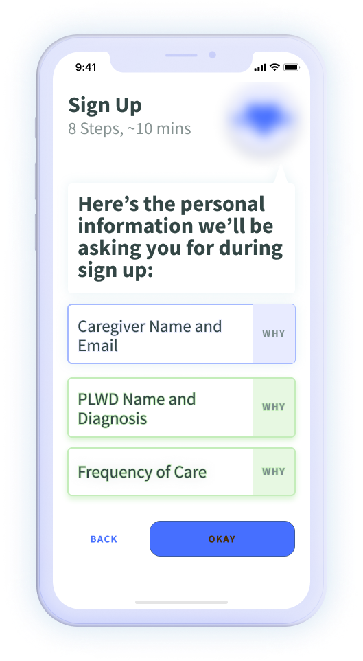
To have the target audience feel safe sharing their information, I added a “why” button to the form fields. The why button lets users understand why the app is asking that info from the user.
We made sure our wireframes used colors and contrast levels to allow accessibility for all types of vision.
Collaborating on wireframe suggestions with the product manager (above) and my team's mid-fidelity sketches (left)

With wireframes ready, it was time to move into user testing. But because of our time constraints, the UX Team needed to split up in order to get both a design system and user testing complete.
Usability Tests
Wanting to continue with my audience-focused design approach, I took charge of user testing and conducted interviews with the product manager (PM). The rest of the team focused on the UI portion.
A section of the usability test template I created for the interviews.
We had to decide on an approach to make the most of our 40-75 minute sessions with each of the six users we interviewed.

We merged our individual styles to create safe spaces for discussion with each user, as I guided the interviews based around reactions of each user, and the PM filled in with questions about each present screen.
It was a pleasure working with Nikita, the product manager.
Using direct quotes, previously conducted research, and deductive reasoning, I created a slide deck with layers of information about the user interviews and target audience.
I included general observations of the target audience as a whole, and for each of the six app features, I detailed:
- A general recommendation about the overall feature
- More specific action items for specific feature parts
- Quotes to support the action items and recommendations
I included recommendations to modify the existing user personas and better guide other designers trying to empathize with this audience.
Including these factors gives insights on different lifestyles of caregivers and care recipients.
Doing research prior to testing, as well as conducting user interviews helped me recognize these key differences between types of users in the target audience.
High Fidelity
I was grateful that the rest of the UX Team solidified the high-fidelity mockups and design system while I was working on the user interviews.
A few of my team's iterated screens (above)
Unfortunately, the non-disclosure agreement leaves me unable to embed a prototype for this project into my portfolio.
The team finalized a royal blue for the primary color, with contrasting green and orange for accents.


Color palettes (above) and two moodboards for inspiration (left) designed by the UX Team
I've included the onboarding high-fidelity screens below.
Some elements blurred as per BENTEN's request.
View more case studies...
.png)


.png)


.png)
.png)