Pockit
After two years of growing, Pockit is well received and has a large base of free users. They now need to design an experience that will allow users to subscribe and pay a monthly fee.
I was tasked with incorporating the company’s business goals and brand attributes to create a premium product with an evolved feature set.
Designing for: 18-24 year-old, very tech-savvy and budget-conscious person.
Brand Attributes: Bold, Hip, Smart
Project Phases
Ideate premium models, user flows, sketch, content ideation, wireframes
Style guide, high-fidelity mockups, implement changes from first usability test
Competitive analysis, secondary research, surveys
Usability testing, user opinions, survey, analysis, MVP decisions
Test CTA design preference, iterate CTA screens


Business Goals
Create the opportunity for new users to subscribe to the premium product upon registration in the signup flow.
Create the opportunity for returning free users to become paid subscribers in the sign-in flow and within the product (while logged in).
Discover
In search of inspiration for the project, I explored industry-leading apps: YouTube, Pandora, and Spotify. In each app, I navigated the premium upgrade process, and took note of my likes and dislikes about each design.
I looked for seven elements in all of the media company's premium upgrade processes, and marked the ones that were common between each of the three companies.
I made certain decisions after comparing elements and process between competitors.
Through financial articles about subscription models, I learned that...
This informed my decision to create a product involving:
- a subscription service
- an emphasis on curation
- unique set of premium features
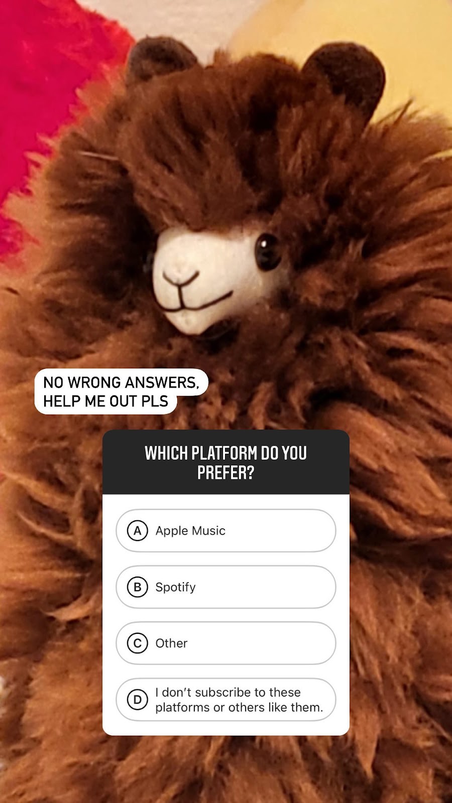
But before starting ideation, I wanted to hear the value of a subscription product from the target audience. Because my peer group matches the target user directly, I asked my followers their opinions on Instagram:
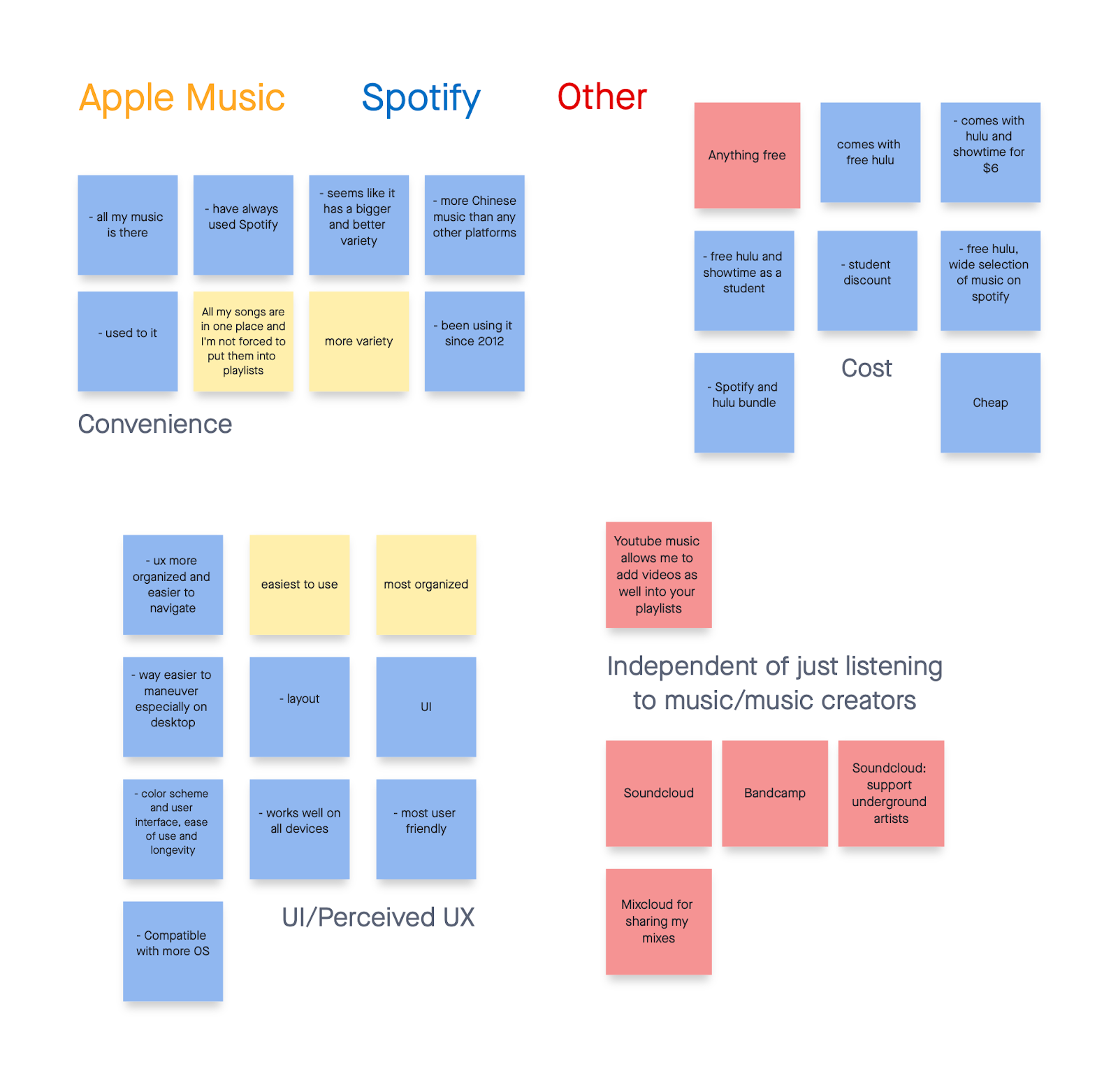
I placed the survey responses and research findings on post-its in Miro and created an affinity map with groups of topics. This helped me quickly recognize common themes in the research.
After reviewing and analyzing my primary and secondary research, I came to more conclusions about my design...
Design
With decisions made and target audience pain points found in the discovery phase, I came up with two subscription models for the premium version of Pockit. Each model has different perks that don't overlap between subscriptions, giving the users an incentive to subscribe to both once they establish trust.
Pockit Pikr provides the full spectrum of in-app features unlocked, with the exception of Pockit Jockey features. It costs $5 per month to subscribe.

Subscription includes: in-app messaging, listening statistics available anytime, expanded queue organization options, etc.

Subscription includes: host listening parties, filter by beats per minute, add metadata to audio files, apply basic effects like crossfade, reverb, etc.
Pockit Jockey provides its subscribers with an additional DJ interface. It costs $2 per month to subscribe.
With insights from research in mind, I crafted four user flows that addressed the business goals and led customers to the premium product.
Drawing out the flows directed me to critical points in the user’s journey where I could place premium calls to action.
To outline the screens in the user flows, I created content inventories of each page as a reference and sketched the basics of each on paper.

Sketching gave me an idea of how I wanted my wireframes to look.
My sketches of various pages within the user flows.
Although I had not defined a visual style for the app at this point, I wanted to keep the brand attributes (bold, hip, smart) in mind, and added some dimension using background gradients when I made the wireframes.
I designed each CTA’s landing page as a list/accordion with a header, primary button, and exit button. I wanted to create a stark contrast to highlight the features, and left the background fairly flat to increase contrast with the “floating” primary button.
Validate
With my low-fidelity designs created, I set out to test my prototype and survey premium features with five members of the target audience.
While users were successfully able to upgrade to the premium content both in-app and in the sign-in flow, I noticed that the participants did not really look at the benefits of the premium subscription. I created a dimensional free service whose premium service seemed to lack dimension.
Player vs. CTA screen: My attempt to increase contrast by having a flat background failed.
In an effort to maintain rapport with the target audience and keep my focus on the business goals of the project, I gauged the target audience’s perceived value of Pockit’s premium features with a survey.
Using a 7-point Likert scale, participants rated each feature from “would never use” being 1 to “would use every day” being 7. This helped me decide which features to leave out of the Most Viable Product (MVP).
Survey questions (top) and answers in the form of histograms (above)
Based on the results of the survey, I eliminated three features from the MVP. They all had less than 60% likelihood of engagement when surveyed by potential users - not worth the user's cognitive load or the company's time.
Iterate
With my wireframes finalized, I moved onto the high-fidelity design, starting off by understanding the brand attributes.
To me, bold, hip and smart means refined elegance with tactful sharpness and underlying intensity. This combination led me to iterate my design with a gender-neutral yet bold indigo, purple, and blue color palette.
The tartness of the indigo pairs well with the depth of the dark blues and still manages to reflect light with the lavender hues. I also took inspiration from neon signs and contrasting dark and light aesthetics.
These colors represent the self (indigo), royalty (purple), and expansion (dark blue). Music is an important part of the user's life, and these colors make them feel like this premium product is catered to them and expanding their world of music their own way.

I included a skeuomorphic “like” button, mimicking a heart entering a pocket. Using a pocket is all about the action of placing something inside it, and I wanted to use skeuomorphism to mimic that familiar action, and establish trust with the user. This also references the “pockited” song going into your library upon this click.
I improved the dimensionality of the navigation bar by deepening the color, adding a gradient and using bright, glowing drop shadows.
User Testing
To create a more engaging experience for the premium CTA, I created a preference test to use with the target audience. Five participants instinctively chose between two different combinations of the same UI elements, varied in either color or layout.
I chose three variations of colors and shapes/layouts to try out with users.
I recorded the instinctual preferences by hand, to make sure the test went quickly and rhythmically.
The "winning" designs from each slide of the preference test.
With the results of the preference test, I compiled the results in groups correlating with the element they were associated with: primary button, background/header visual, and the layout of the CTA perks.
I was slightly disappointed, as I personally wanted the left layout to win, but the right layout won!
With the elements picked, out I was able to create an instinctually attractive CTA screen based on the audiences preferences. Below, the left two screens show the CTAs original layouts, while the right two show the new layouts.
I pieced together a prototype in Figma that takes the user through the app, with the eventual goal of getting the user to access the premium call-to-action screens.
View more case studies...


.png)


.png)